The biggest story in the world this year — markets, economics, politics, anything — was the US presidential election win by Donald Trump .
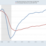
And no single chart told the story of Trump’s election better than the following, which revealed the inconvenient truth about US manufacturing employment and US manufacturing output.
What we see in this chart is the red line showing US manufacturing employment levels about 10% below where they were a decade ago. The blue line shows manufacturing output, which in contrast has fully recovered from the recession and then some.In short, we find that US manufacturing workers are […]
Full Post at sports.yahoo.com